As the leaves turn golden and the air gets crisp, it’s the perfect time to bring autumn vibes into your planner spreads. Choosing the right color palette sets the mood for the season and makes your pages feel cozy, intentional, and inspiring.
In this guide, we’ll share our favorite autumn color combinations and how to use them with stickers, washi tape, and journaling layouts.
🍁 Why Color Palettes Matter in Planning
Colors can completely transform the feel of your planner. Warm, muted autumn tones create a sense of calm and nostalgia, while bold seasonal shades add energy and excitement. By sticking to a palette, your spreads feel more cohesive — and you’ll spend less time overthinking decoration.
If you love design-focused planning, check out our post on Aesthetic Journaling for more inspiration.
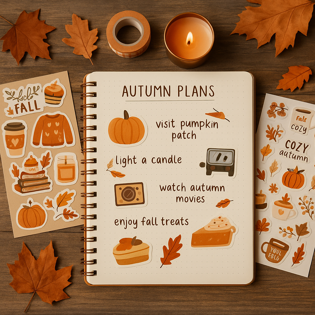
🎨 5 Autumn Color Palettes to Try
1. Pumpkin Spice & Cozy Neutrals

- Burnt orange
- Cream
- Warm beige
- Soft brown
Perfect for October spreads, this palette pairs beautifully with fall stickers featuring pumpkins, coffee cups, and leaves.
2. Golden Leaves & Forest Walks

- Mustard yellow
- Olive green
- Deep brown
- Off-white
This nature-inspired palette is great for gratitude journaling. Try adding washi tape in leaf or plaid patterns for an earthy touch.
3. Moody Autumn Evenings

- Deep burgundy
- Plum purple
- Charcoal gray
- Warm cream
Perfect for evening or cozy night themes, especially if you like a more dramatic, romantic vibe.
4. Harvest Market

- Warm terracotta
- Wheat yellow
- Sage green
- Rustic brown
Inspired by farmer’s markets and fall gatherings, this palette works well with functional stickers for meal planning, shopping lists, or seasonal to-dos.
5. Soft Sweater Weather

- Dusty rose
- Light taupe
- Cream
- Warm gray
This muted palette is ideal if you love minimalist spreads with a soft, feminine touch.
✏️ Tips for Using Color Palettes in Your Planner

- Pick 2–3 main colors and 1–2 accents for balance.
- Use washi tape, highlighters, or sticker headers in your chosen colors.
- Add themed stickers — pumpkins, mugs, leaves — to tie everything together.
- Keep your writing tools consistent (e.g., black or brown ink) for a neat look.
- Repeat the same palette across multiple spreads for a harmonious seasonal theme.
🍂 Final Thoughts

Autumn is a season full of warmth and inspiration — and your planner can reflect that. Whether you love bold, vibrant shades or soft, muted tones, a well-chosen color palette can make your spreads feel intentional and beautiful.
✨ Ready to decorate your planner?
Explore our seasonal collections: